Birth can be beautiful.
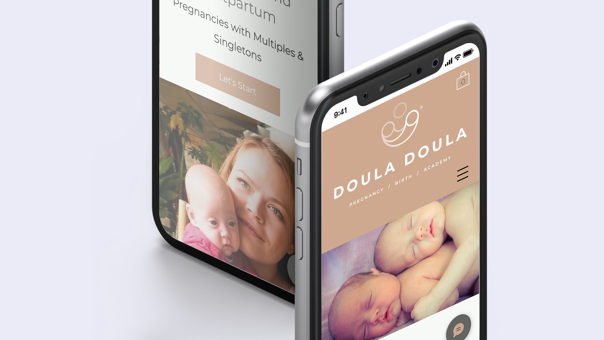
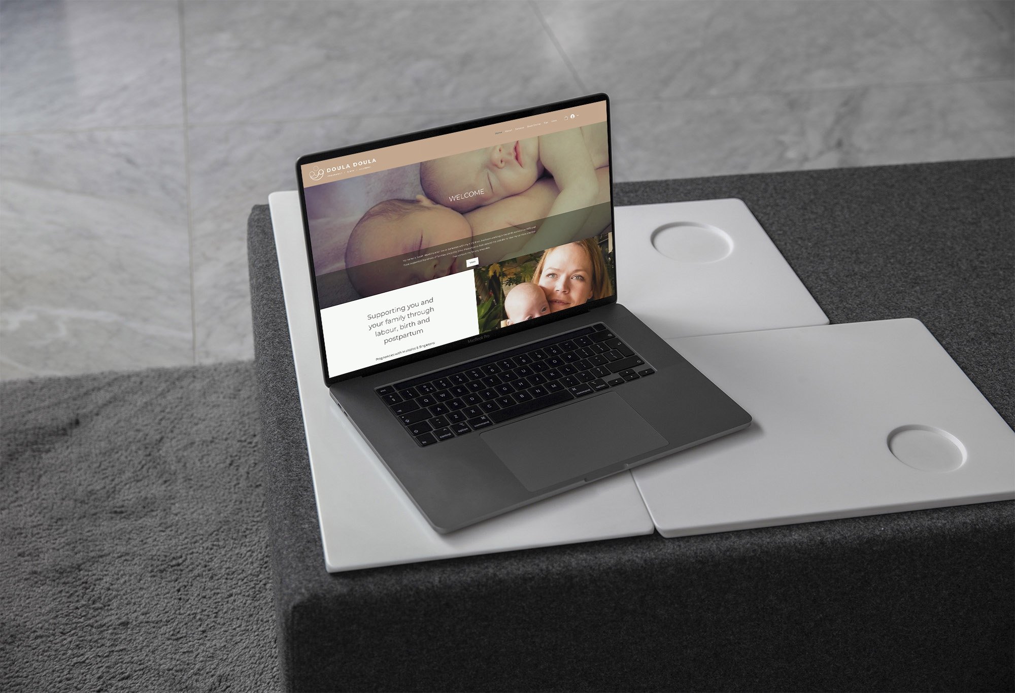
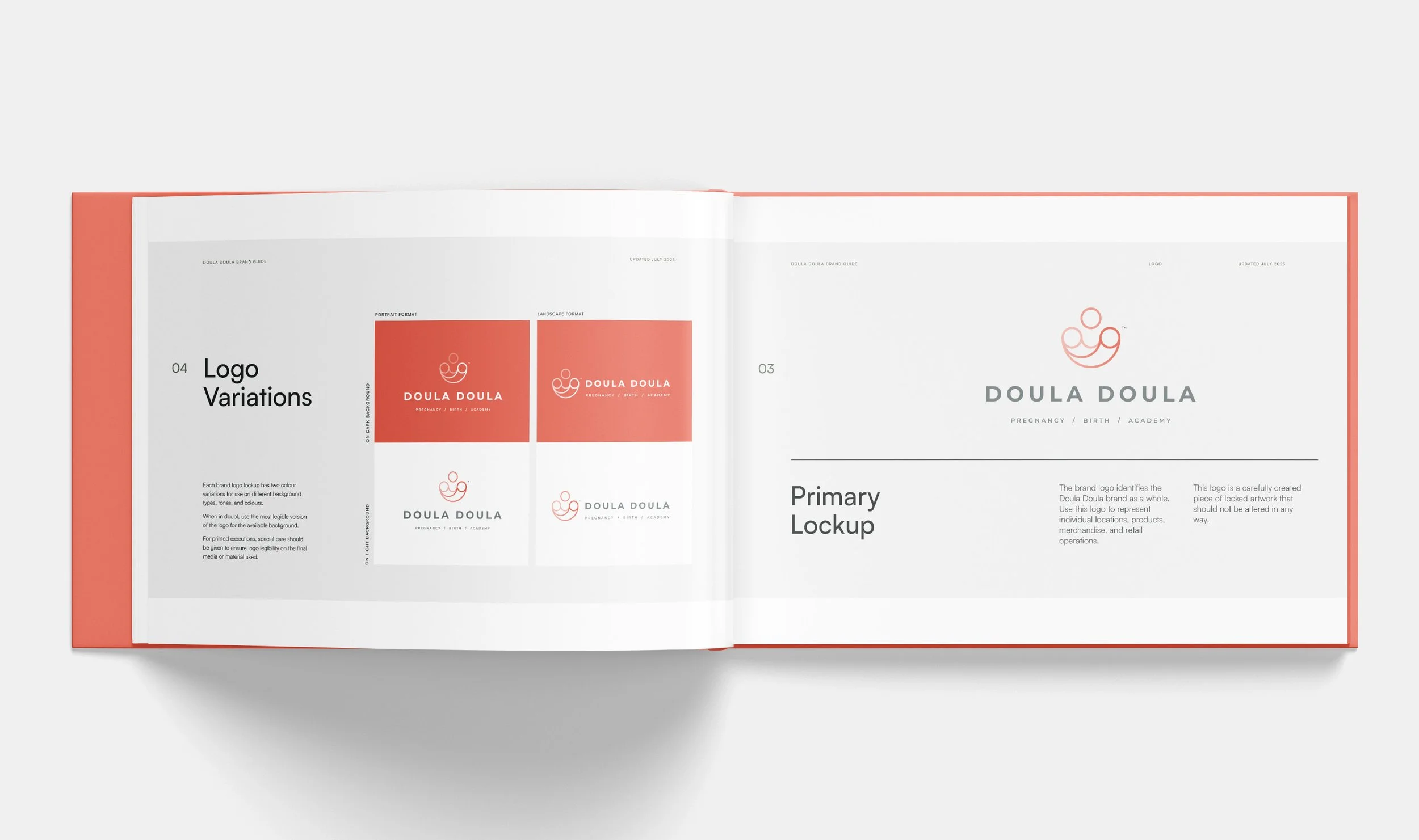
Sarah Hawkins is a registered Doula in the west country. She approached us originally as she was aware her identity was in need of an upgrade but we knew she needed a re-brand too. Luckily for us Sarah was up for seeing our ideas and how this could help her business to develop and define her unique offer as a multiple birth Doula - hence the new name Doula Doula!
As she was keen to convey her welcoming and friendly style of doing business we produced a logo which conveyed twin new born babies in the arms of mum illustrated by a set of intersecting circular shapes. The brand colours where deliberately chosen to be warm and friendly with a lovely reddy/pink as the primary colour together with a palette of complementary powder blues, creams and greens.
Research / Strategy / Brand identity / Copywriting / Project Management / Website design / Marketing communications